If you have ever clicked an ad or a promotional link and landed on a focused page asking you to sign up, download something, or buy a product, you have used a landing page. But what is a landing page, exactly, and how is it different from a regular website page? For beginners in digital marketing, understanding landing pages is one of the most useful skills you can learn, because nearly every online campaign, from ads to email promotions, depends on them.
In simple terms, a landing page is a standalone web page built around a single goal: getting the visitor to take one specific action. Unlike a homepage, which introduces your whole business and offers many paths, a landing page removes distractions and guides every visitor toward the same outcome, whether that is joining an email list, claiming a discount, or making a purchase.
This beginner’s guide explains what a landing page is, breaks down the anatomy of a page that converts, walks you through creating one step by step, and covers the conversion basics that separate pages that work from pages that waste your traffic.
What Is a Landing Page, Exactly?
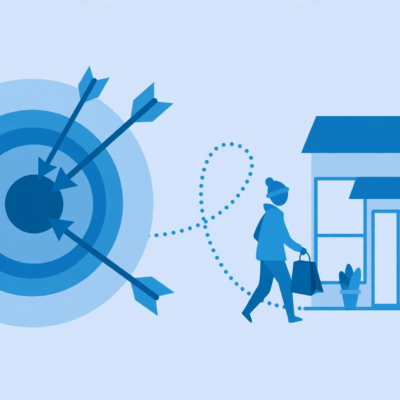
A landing page is any page a visitor “lands” on after clicking a marketing link, but in practice the term means something more specific: a dedicated page designed for one campaign and one conversion goal. When someone clicks your ad for a free ebook, they should land on a page about that ebook, not your general homepage.
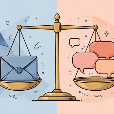
The key difference between a landing page and a homepage is focus. A homepage serves everyone: it introduces your brand, links to your products, your about page, your blog, and your contact details. A landing page serves one visitor intent. It typically has no full navigation menu, no sidebar, and no competing links, because every extra link is an exit ramp away from the action you want.
Think of it this way: a homepage is like the front door of a store, welcoming and full of options. A landing page is like a salesperson who walks one customer straight to the single product they asked about. Both have their place, but when you are paying for clicks or promoting a specific offer, the focused approach almost always performs better.
The Anatomy of a High-Converting Landing Page
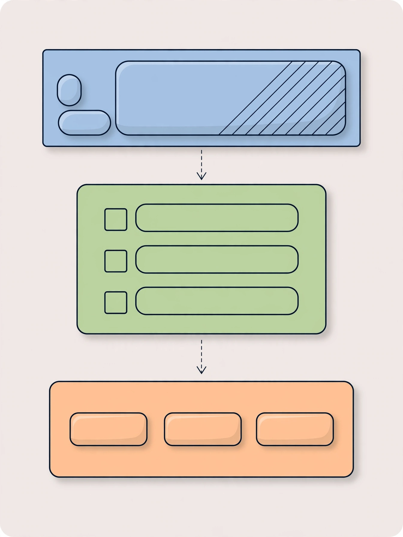
Effective landing pages share the same core building blocks. Learn these elements and you can evaluate, or build, any landing page with confidence.
1. A clear headline. The headline is the first thing visitors read, and it should match the promise of whatever brought them there. If your ad says “Free Social Media Calendar,” the headline should say the same thing, not something clever and vague. Matching the message between the ad and the page reassures visitors they are in the right place.
2. A supporting subheadline. One or two sentences that expand on the headline and explain the main benefit. This is where you answer the visitor’s silent question: “What is in it for me?”
3. A compelling offer. The offer is what the visitor gets in exchange for taking action: a free guide, a discount, a trial, a consultation, or a product at a special price. Strong offers are specific, valuable, and easy to understand in seconds. Vague offers like “sign up for updates” rarely convert because they promise nothing concrete.
4. A single call to action. The call to action, or CTA, is the button or link that asks for the conversion: “Download the Free Guide,” “Claim Your Discount,” “Book Your Free Call.” Great CTAs use action words and describe the outcome, not just “Submit” or “Click Here.” A landing page should have one primary CTA, repeated in a couple of places on longer pages, so visitors never wonder what to do next.
5. A simple form. If your goal is lead generation, the form is where the conversion happens. The golden rule: ask only for what you truly need. Every extra field reduces conversions, so a name and email address is often enough to start. You can always collect more information later.
6. Trust signals. Visitors who do not know you need reasons to trust you. Testimonials, customer logos, review snippets, guarantee statements, and privacy notes (“We will never share your email”) all reduce the perceived risk of taking action. Use only genuine trust signals, never invented ones.
7. Relevant visuals. Images or short videos that show the offer in context help visitors picture the benefit. A mockup of the ebook, a photo of the product in use, or a brief demo video all outperform generic stock photos. If you want to create short promotional videos for your page, this guide to AI video generators covers beginner-friendly options.
Common Types of Landing Pages
Not all landing pages do the same job. Here are the types you will encounter most often:
- Lead generation pages. Built to collect contact information, usually an email address, in exchange for something free like a guide, checklist, webinar seat, or discount code. These are the workhorses of email list building.
- Sales pages. Longer pages designed to sell a product or service directly. They walk through benefits, features, proof, pricing, and guarantees, ending in a buy button or checkout link.
- Click-through pages. A middle step between an ad and a checkout or signup page. They warm visitors up with benefits and details, then send pre-sold visitors to the final conversion page.
- Coming soon pages. Simple pages that collect emails before a product or website launches, often with a countdown or a short teaser of what is coming.
- Thank you pages. The page visitors see after converting. Smart marketers use it to deliver the promised download, set expectations, and offer a logical next step, like following on social media or sharing with a friend.
Landing Page Builders: What to Look For
You do not need to know how to code to create a landing page. Modern landing page builders let you assemble pages with drag-and-drop editors, ready-made templates, and built-in forms. When choosing one, beginners should look for a few essentials.
First, check for templates designed for your goal. A good builder offers separate templates for lead generation, sales, webinars, and coming soon pages, so you start from a proven layout instead of a blank canvas. Second, look for mobile responsiveness: your page must look and work perfectly on phones, since most traffic arrives on mobile. Preview every template on a phone screen before committing.
Third, confirm form and email integrations. Your builder should connect easily with your email marketing tool so new leads flow into your list automatically. Fourth, look for basic analytics and testing. Even simple conversion tracking and the ability to test two headlines against each other will teach you more in a month than guessing ever could.
Finally, consider cost realistically. Many website platforms and email tools include basic landing page builders in their free or low-cost plans, so you may not need a separate paid tool when starting out. Begin with what you already have, and upgrade only when your campaigns outgrow it.
How to Create a Landing Page: Step by Step
Here is a practical process for building your first landing page from scratch.
Step 1: Define the single goal. Write down exactly one action the visitor should take, in one sentence. “Get visitors to download the free budgeting checklist” is a goal. “Tell people about my business” is not. Every decision that follows serves this sentence.
Step 2: Know your traffic source. A landing page should match the expectations of the people arriving at it. Visitors from a paid ad campaign expect the page to deliver exactly what the ad promised, which is why many businesses build dedicated pages for each ad group. This outline of a Google Ads campaign structure shows how ads and landing pages are planned together, even in specialized niches.
Step 3: Write the copy before you design. Draft your headline, subheadline, benefit bullets, and CTA text in a plain document first. Writing before designing keeps you focused on the message instead of getting distracted by layouts and colors.
Step 4: Choose a template and customize it. Pick a template built for your page type, then replace the placeholder content with your copy. Keep your branding consistent but resist the urge to add extra sections “just in case.” If a section does not serve the single goal, remove it.
Step 5: Add your form and connect it. Place your form where visitors can see it without scrolling, and connect it to your email list or CRM so leads are captured automatically. Test the form yourself with a real submission before publishing.
Step 6: Add trust signals. Place one or two genuine testimonials near the CTA, add a short privacy reassurance by the form, and include any guarantees you truly offer. Keep them honest and specific.
Step 7: Publish, test, and refine. Check the page on your phone, click every button, and submit the form. Then share the link with a few people and watch where they hesitate. Small fixes, like a clearer headline or a shorter form, often produce the biggest improvements.
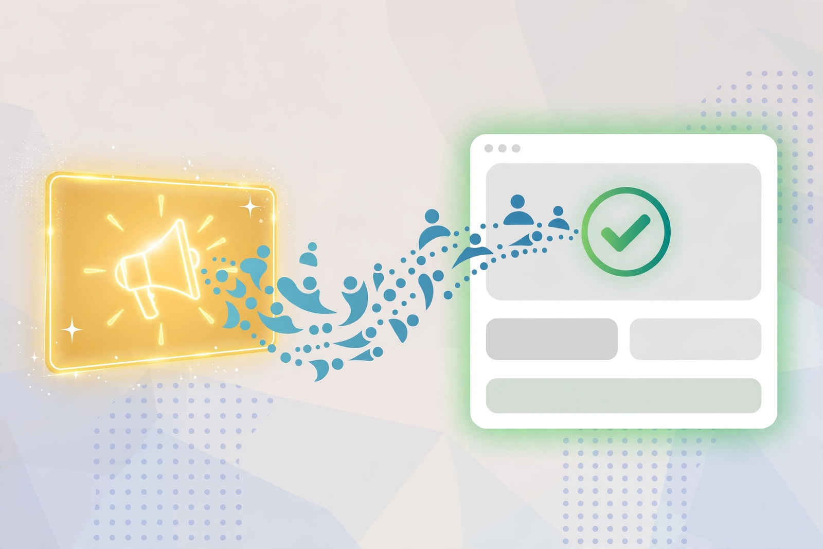
Landing Page Conversion Basics Every Beginner Should Know
Conversion rate simply means the percentage of visitors who take your desired action. You do not need advanced tactics to get the fundamentals right.
One page, one goal. The highest-impact rule in landing page design. Every link, image, and paragraph should push toward the single action. Remove navigation menus and unrelated links so visitors cannot wander off.
Match the message. The headline, offer, and visuals on your page should mirror the ad, email, or post that sent the visitor there. When the message matches, visitors feel confident; when it does not, they bounce.
Make the CTA impossible to miss. Use a contrasting button color, action-oriented text, and repeat the CTA after each major section on longer pages. The visitor should never have to search for what to do next.
Keep forms short. Ask for the minimum information you need to follow up. You can progressively collect more details later as the relationship develops.
Load fast and look right on mobile. Slow pages lose visitors before they read a word. Compress images, avoid heavy scripts, and test the full experience on a real phone, not just a desktop preview.
Test one thing at a time. Change your headline, measure for a week or two, then change the CTA text, then the hero image. Testing one variable at a time tells you what actually caused the improvement. If you want outside help with the traffic side of things, working with specialists can help; this look at an SEO agency case study shows how professionals structure campaigns around focused pages.
Common Landing Page Mistakes to Avoid
- Sending ad traffic to a homepage. Homepages give visitors too many choices. Dedicated landing pages consistently convert better because they match the visitor’s intent.
- Asking for too much information. Long forms with phone numbers, company names, and job titles scare off casual visitors. Start small.
- Weak or vague headlines. Clever headlines that do not say what the page offers will lose visitors in seconds. Clarity beats cleverness.
- Multiple competing CTAs. “Download the guide,” “Watch the demo,” and “Chat with sales” on one page splits attention and lowers conversions. Pick one primary action.
- No trust signals. Anonymous pages with no testimonials, no real company details, and no privacy reassurance make visitors hesitate, especially when you ask for their email.
- Ignoring mobile. If buttons are hard to tap or text requires zooming on a phone, a large share of your traffic will leave without converting.
- Never testing. Publishing a page and never reviewing its performance leaves easy improvements on the table. Check your numbers regularly and keep refining.
For a broader look at digital marketing fundamentals that pair well with landing pages, browse the DigitalGeekSpot homepage for more beginner-friendly guides.
Frequently Asked Questions
What is a landing page in simple terms?
A landing page is a standalone web page with one job: getting visitors to take a single action, like signing up, downloading something, or buying. It has minimal navigation and no distractions, so all attention points toward that one action.
What is the difference between a landing page and a website?
A website is a collection of many pages serving many purposes: about, blog, products, contact, and more. A landing page is a single page built for one campaign and one goal. Websites inform and explore; landing pages focus and convert.
Do I need a landing page if I already have a website?
In most cases, yes, at least for campaigns. Sending ad or email traffic to a focused landing page almost always converts better than sending it to a general homepage, because the page matches the visitor’s specific intent instead of offering dozens of options.
How long should a landing page be?
As long as it needs to be to make the case, and no longer. Simple offers like a free checklist work well on short pages with a headline, a few bullets, and a form. Expensive or complex offers need longer pages with more proof, details, and reassurance. Match the length to the size of the ask.
Can I create a landing page for free?
Yes. Many email marketing tools, website builders, and dedicated landing page platforms offer free plans or trials that include landing page builders with templates and forms. Start free, prove the concept with real traffic, and pay for advanced features only when you need them.